A recent article published in the Washington Post caught my attention after it was shared on social media by multiple scientists, environmentalists and politicians. The headline serves as a dire warning to readers that our environmental inaction has led to hotter, longer and more dangerous summers in the United States. I took some time to read through the article, and almost immediately I spotted multiple red flags.
Before I dive in, I should start by prefacing that man-made climate change is in fact real. I have never stood in contrast to the physical principles that explain most of the long-term warming trend. That being said, the objective of a scientist is to provide a rationale for the physical world around us. In order to achieve any sort of environmental progress, the polices that are being proposed need to be based on what the body of scientific work is telling us, not opinionated or emotional reasoning. Scientists themselves are often not apolitical. They’re quick to call out climate-denying conservatives, but refuse to fact-check environmentalists spouting hysteria because it “hurts the cause” for climate action. It’s important that science be a means of bridging the gap to reaching bipartisan goals, because shoddy science yields bad and potentially disastrous policy outcomes.
So, without further ado, let’s see if the Washington Post’s assertions of fact hold any water when stacked against temperature data and various peer-reviewed works.
The piece, published in their “Climate & Environment” section, begins with five paragraphs detailing recent droughts, floods, hurricanes and primarily temperature trends and wildfires in the Reno, Nevada area, all of which are largely irrelevant to their thesis statement. So, I’ll skip that.
By this point, the wheels begin falling off the wagon. Immediately, the authors begin making their case that summers are becoming hotter, longer and more dangerous by juxtaposing the last five summers (2017-2021) against the 30-year means from 1971 to 2000 and provide an admittedly appealing map (Figure 1) as a visual.
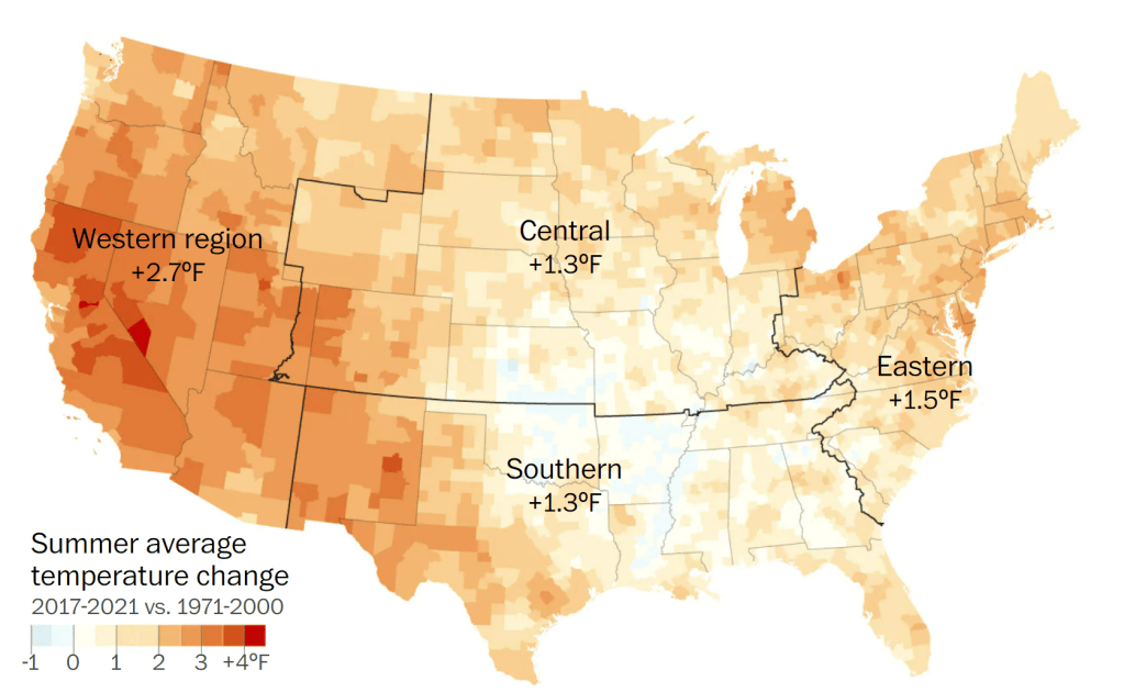
Right off the bat here, there are two red flags. Not only is the 30-year period used in their analysis rather arbitrary, why would the authors use the most recent five summers as a comparison against a baseline that hasn’t been used as a climatological reference point by scientists in over two decades?
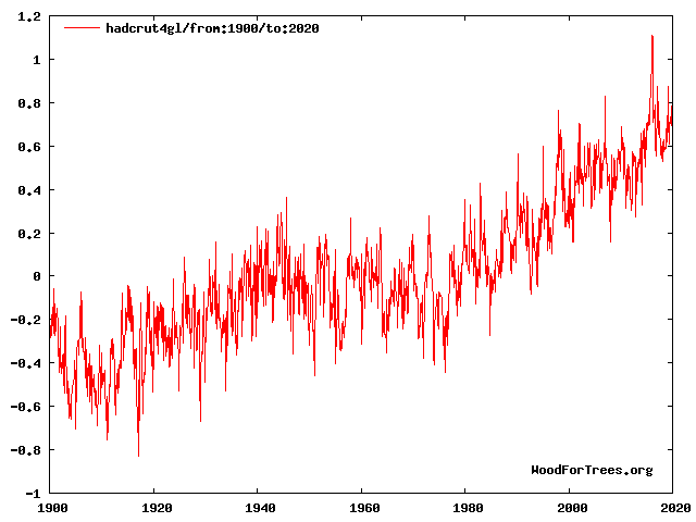
Furthermore, it is a well-established fact that the 1970s—the beginning of their analysis period—was the coldest period globally since the early 20th century (Figure 2), and at that time, many scientists feared we were headed toward another ice age, something the Washington Post themselves reported on.
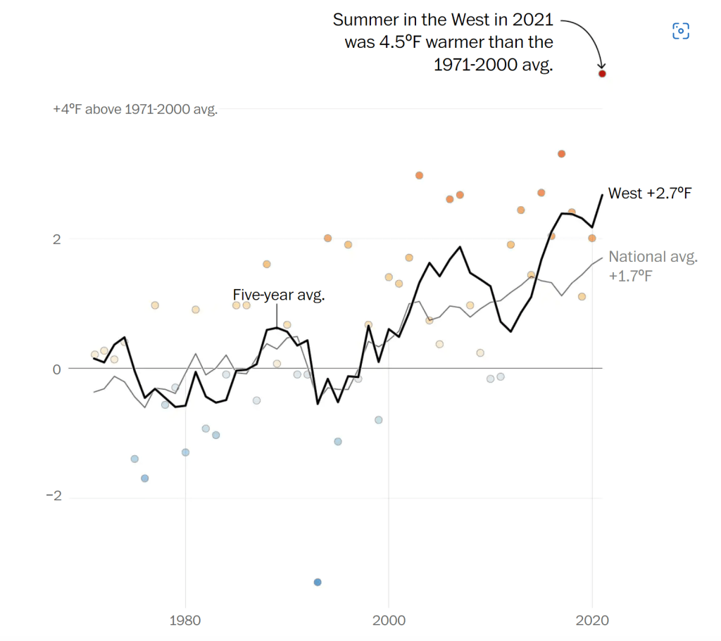
To further their point, it’s claimed that “…the recent spate of severe summers is a clear change from previous generations” and “…heat waves are arriving more frequently, more intensely and earlier in the year” because summer temperatures nationwide have warmed 1.7°F (0.94°C) since 1971. Compounding matters, the warming in the western third of the country has been even more pronounced with a 2.7°F (1.5°C) rise over the same period analyzed. See the plot below (Figure 3).
What makes me question the premise of using the most recent 50 years to make such definitive claims is that the United States arguably has the most coherent, long-term temperature record in the world. The United States Historical Climatology Network (USHCN) consists of over 1,000 weather stations that maintain daily temperature and precipitation data, many dating back to 1895, if not earlier than that. So, with at minimum 127 complete years of data, there’s no reason to not use the entire period of record unless you’re trying to be intentionally deceptive.
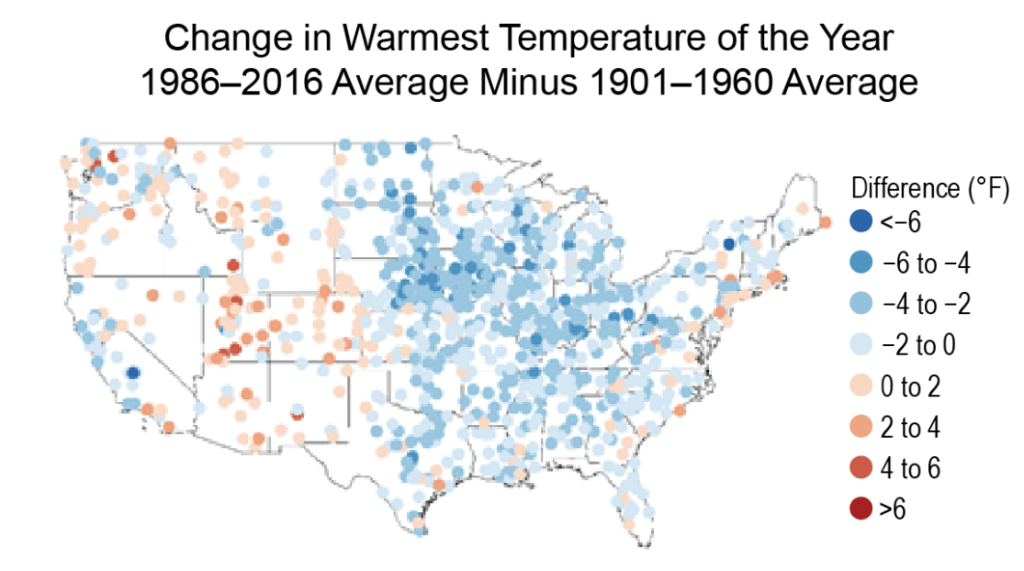
Similar to their plot of average temperature change, the recent National Climate Assessment (NCA4) has a plot in Chapter 6 that conveys the change in the warmest temperature of the year using the 1986-2016 average subtracted from the 1901-1960 average (Figure 4). Just from a quick glance, it’s clear that summers aren’t becoming hotter when a much longer time frame is used.
The National Climate Assessment notes, “…the warmest daily temperature of the year increased in some parts of the West over the past century, but there were decreases in almost all locations east of the Rocky Mountains. In fact, all eastern regions experienced a net decrease, most notably the Midwest (about 2.2°F [1.2°C]) and the Southeast (roughly 1.5°F [0.8°C]).”
So, it’s clear from the data above that the hottest temperatures of the year aren’t becoming warmer. But, what about individual heatwaves? Are they becoming more frequent? Are they becoming more intense? To answer this question, the National Climate Assessment put together these two plots using long-term Global Historical Climatology Network (GHCN) stations, the top (Figure 5a) of heatwave frequency in the Contiguous United States between 1900 and 2016, and bottom (Figure 5b) of heatwave magnitude index (the same one the EPA uses) over that same 116-year period.
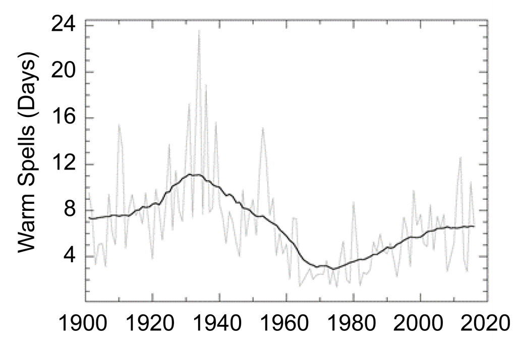
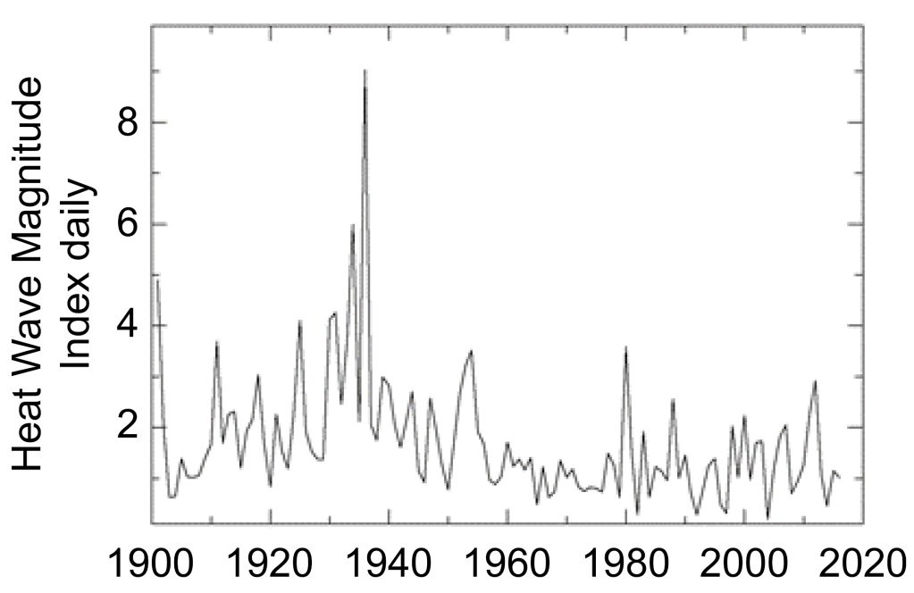
Once again, it’s clear that the heatwaves during the ‘Dust Bowl’ era of the 1930s (when 25 states set or tied their all-time record highs) remain unmatched as they set an impressive benchmark that more than likely will never be achieved again, at least in our lifetimes. It’s true that if one were to start these graphs in say, 1960 or 1970, there’s an upward trend, but because we have more than sufficient data to compile, it isn’t justifiable for a scientist to begin their analysis at a low point.
If I were to be an outsider and look at this from a statistical standpoint, the 1930s are an outlier in the dataset. Yet, even if I were to remove it from the picture for control purposes, heatwaves in recent decades still don’t hold a candle to those during the first half of the 20th century. With the notable exceptions of the summers of 1980 and 2012, one would really have to go back to 1955 or earlier to find scorching hot summers year after year.
Based on this alone, the Washington Post’s claim that heatwaves are becoming more frequent and intense is just flat-out misdirection. This leaves us with the original question to answer—are summers as a whole becoming hotter and more dangerous? To answer the first part, we need to look at four important charts.
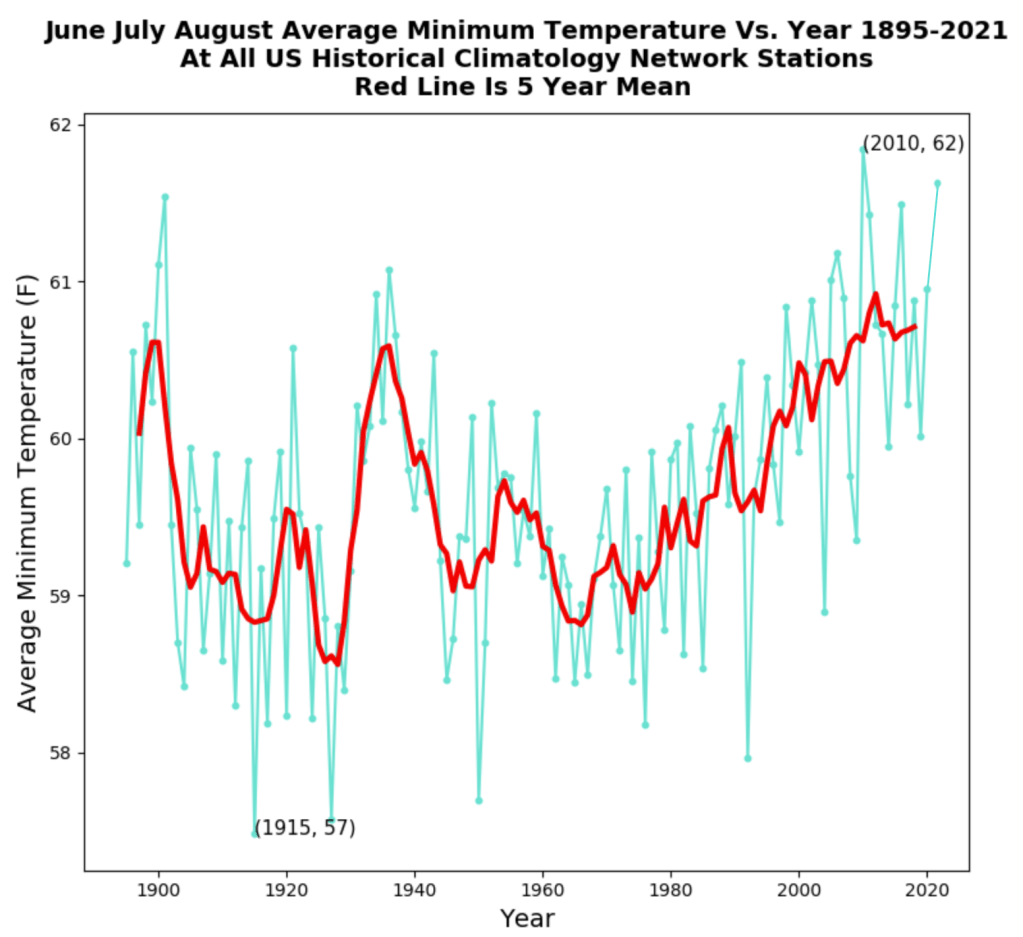
The plot below (Figure 6) shows the average mean temperature at all 1,221 United States GHCN stations going back to 1895 with the red line being the 5-year running mean. I plotted this chart using an open-source software you can download here by following the steps provided. The data files are directly from the National Oceanic and Atmospheric Administration (NOAA).
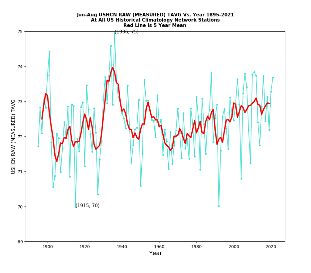
What is clear from the data is that there has been little change in summertime temperatures over the last 127 years. This is exactly opposite of the alarming assertions made in the article. Last summer was actually 12th hottest on record, and while still significant is nothing to be alarmed about.
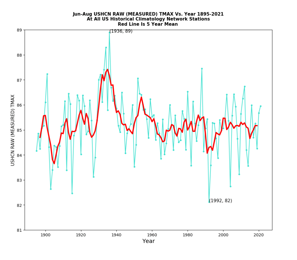
By average maximum temperature (Figure 7), last summer wasn’t anywhere near the top. In fact, it ranked 33rd hottest!! And, out of the top 10 warmest, only one has occurred within the last 30 years—unsurprisingly, 2012. It can be argued here rather aggressively that summer afternoons have been cooling for the last 80 or 90 years. So, here arises a new question. Why the discrepancy between the average mean and average afternoon highs?
The answer lies in the fact that overnight lows have been warming rapidly since the 1960s (Figure 8). Part of this can be explained by man-made climate change as the warming caused by the radiative imbalance imposed by “greenhouse” gases allows the air to evaporate more water, which creates a feedback loop that significantly affects the ability of the Earth’s surface to radiatively cool to outer space overnight.
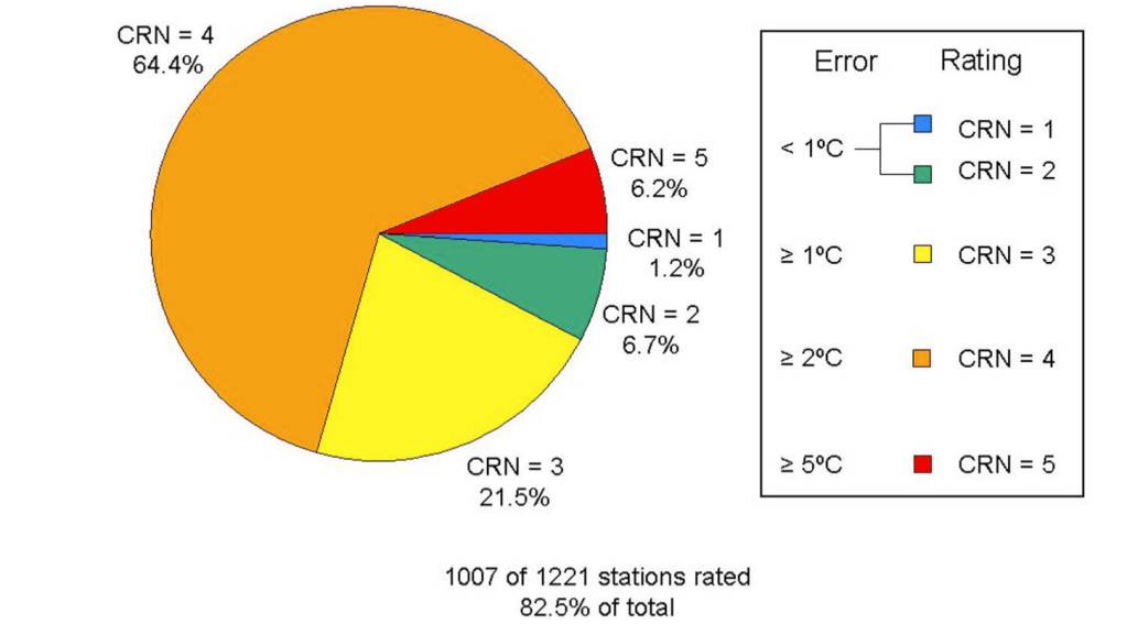
However, much of this is likely an artifact of poor station siting, a byproduct of increasing stress from the urban heat island effect. Several studies, many of which have been conducted by meteorologist Dr. Roger Pielke, Sr. have examined the issue of poor station siting. One particular study published in the Journal of Geophysical Research that he co-authored with meteorologist Anthony Watts and Alabama state climatologist Dr. John Christy in 2011 surveyed 1,007 of 1,221 (82.5%) of existing United States GHCN stations and rated each based on their quality. Fall et al. (2011) found that a whopping 70.6% of stations were poorly sited (e.g., being in close proximity to asphalt, concrete, buildings, A/C units, etc… that absorb and re-emit lots of infrared radiation contributing to higher thermometer readings), with 64.4% of them being rated CRN 4 and 6.2% CRN 5. Only 7.9% were rated CRN 1 or 2 for being high in quality. The pie chart used in the paper to graphically visualize their findings is shown below (Figure 9).
Why this is important to take into consideration when doing trend analysis is because warming trends that result from urban sprawl don’t necessarily represent the long-term temperature trends of suburban or rural surroundings. Time and time again I have pointed this out to broadcast meteorologists who use long-term trends in an individual city as a proxy for their entire forecast area, but I have never once been acknowledged. To me, this says that they have no interest in providing the public with accurate information.
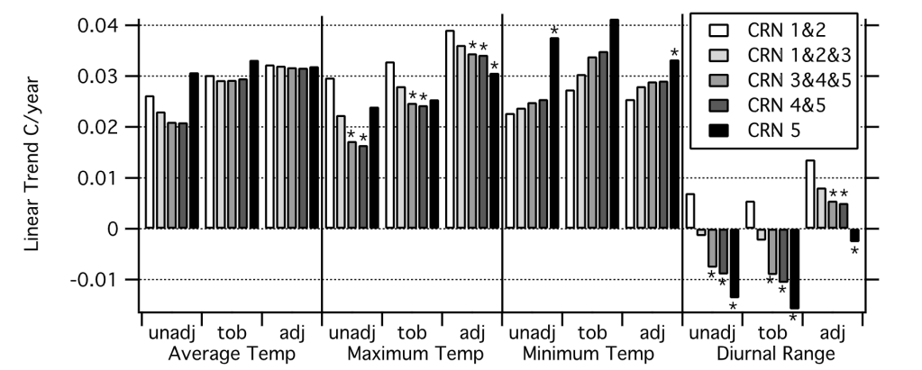
Nevertheless, Fall et al. (2011) found that minimum temperatures exhibited the steepest increase at GHCN stations rated CRN 4 or 5. Figure 10 below shows the bar graphical representation of the linear trend in degrees Celsius per year. Notice how CRN 5 minimum temperatures stick out like a sore thumb, whereas there’s less divergence in trends between the entire sample of stations with respect to their average maximum temperature.
If you live in a very rural valley, you’re probably aware of the fact that on nights with clear skies and light winds, the air temperature near the surface cools quite rapidly in comparison to the air aloft, such as on a mountain. While the soil or grass itself is not the best conductor, it still absorbs and emits far more radiation than the air, which means that its diurnal temperature fluctuation is far greater. As such, air near the ground cools more rapidly overnight than the air aloft if there’s no vertical mixing. This is what allows the boundary layer to decouple resulting in what we in meteorology call a radiational temperature inversion. Big sciency terms, I know.
In urban settings, the concrete, asphalt and towering buildings are much stronger absorbers—and therefore emitters (think Kirchhoff’s Law!!)—of radiation. So, during the day, they amass a lot of shortwave solar radiation and overnight re-emit it back into the environment at infrared wavelengths. This, compounded with the disruption of wind flow, vigorously mixes the air and keeps cities sometimes 10-20° warmer than neighboring areas. Over time, this contributes to an apparent warming trend that isn’t exhibited in afternoon temperatures where air is mixed better universally.
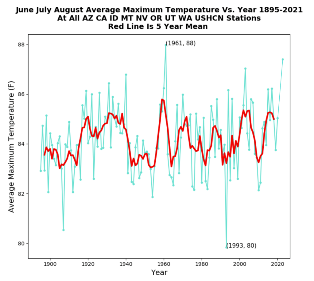
This is why I put an intense focus on average maximum temperatures because they are a better representation of reality. So, for fun, I decided to plot the same (Figure 11) for the western third of the United States using the same states from the Washington Post article. There’s nothing at all alarming about summer maximum temperature trends, and in fact, despite last summer’s record-setting heatwave in the Pacific Northwest, it wasn’t enough to eclipse 1961, which was by average maximum temperature, a few tenths of a degree warmer.
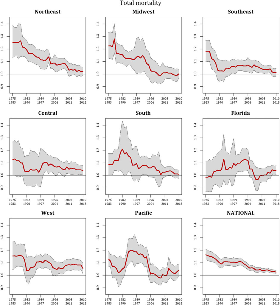
Okay, so now that’s out of the way, what about vulnerability? Are summers becoming too dangerous in the United States? Actually, no. Sheridan et al. (2021) found that while in recent years there’s been a leveling in the decades-long trend of decreased heat-related mortality, overall societal risk has dropped significantly since the mid-1970s. I’d hazard to guess that far greater deaths occurred in the decades prior to the period covered in the paper, but this just goes to show how society has become better equipped to both mitigate and adapt to extreme weather.
Several studies and peer-reviewed literature, such as the IPCC AR6 report (Chapter 11), do note with high confidence that heatwaves have become more frequent and intense since 1950. However, with the extremes of the 1930s in the United States, it makes both detection and attribution here rather arduous.
Case in point, while the effects of climate change may be exhibited in the form of increasing amounts of extreme heat in certain regions, this has yet to be seen in the United States and more than likely won’t be for years or even decades to come. It should also be stated that GHCN stations with coherent, long-term weather records outside of the United States are few and far between, which poses yet another challenge in detection and attribution, something I think is often ignored in IPCC assessments and other journal publications, which leads to overconfidence in their conclusions.
So, the bottom line is this. Yes, summers are hot. They always have been, they always will be. There’s no empirical evidence as of now to suggest that, at least here in the United States, that we are observing more frequent and intense heatwaves or that it is becoming increasingly dangerous.
Studies Cited
[1] “Climate Science Special Report: Temperature Changes in the United States.” Temperature Changes in the United States – Climate Science Special Report, https://science2017.globalchange.gov/chapter/6/.
[2] Fall, Souleymane, et al. “Analysis of the Impacts of Station Exposure on the U.S. Historical Climatology Network Temperatures and Temperature Trends.” Journal of Geophysical Research, vol. 116, no. D14, 30 July 2011, https://doi.org/10.1029/2010jd015146.
[3] Sheridan, Scott C., et al. “Recent Trends in Heat-Related Mortality in the United States: An Update through 2018.” Weather, Climate, and Society, vol. 13, no. 1, 1 Jan. 2021, pp. 95–106., https://doi.org/10.1175/wcas-d-20-0083.1.
Categories: Climate

“man-made climate change is in fact real.” Of course Chis, it is called Urban Heat Island effect (UHI).
1) UK summer, remote vs urban weather stations
2) Scotland: 5 stations summer annual mean max vs atmos CO2
3) NSW: Sydney vs 3 rural country towns, Summer annual mean Max Temperature
LikeLike
Sorry, images didn’t load.
LikeLike
loading image test:
https://postimg.cc/JtyHVYVW
LikeLike
Nicely presented. While human activity is contributing to the change the elephant in the room is that the normal cycles of our star and so forth impact on climate despite anything else. My concern is that this push to green energy as the cure is faulty as it disregards so many other human activities that have become prevelant in modern society that are ignored in the narrative but are part of the problem.
LikeLike
Thank you!! I’m glad you enjoyed the article. If I may, however, I think that solar cycles have very little impact on climate change as far as a year-to-year and decade-to-decade basis. Solar (and orbital) cycles tend to be on much larger time scales. The reason I say this is because the amount of energy coming into the climate system via the sun (shortwave energy) is just as important as the amount of energy being emitted back to space in infrared wavelengths. The balance between these two is what determines temperature; it can’t be computed on energy gain alone. So, when you add gases like carbon dioxide to the air, which have a physical structure and vibrational modes allowing them to interact with various wavelengths of radiation, you do get some warming. However, the warming itself has been very benign and slow. Climate models produce twice as much warming as has been observed by satellite data, which shows that other natural cycles (e.g., multidecadal oceanic oscillations) and feedbacks (such as changes in cloud cover) help limit the amount of warming; this is called the cloud-thermostat hypothesis.
LikeLiked by 1 person
Good point there. However, we are meant to be in a solar minimum until roughly 2030 or 2053 depending on which boffin is calling it. which idoes have an impact considering the experts reckon we entered this cycle in 2019 or 2020 depending on the expert.
I was having a yarn with my neighbour about this today and for sure we have to address the mess we’ve made. Yet to lump ALL climate change on human activity is a faulty premise.
LikeLike
If Svensmark and Naviv are credible, sunspot activity deflects cosmic rays away from our solar system. They claim (with some support from the CERN experiments) that cosmic rays increase cloudiness and thereby decrease our temperatures. The warming of Mars concomitant with Earth’s warming also supports their hypothesis.
I do not claim that they are right; just that alternant explanations exist.
LikeLike
Yeah it is a bit of a minefield but the outcome if the green experiment fails in terms of the human cost is immense. My main beef is that “The Science” these days is more subjective than ever. Not that there haven’t been some amazing subjective science that held mainstream sway in times gone past … times not that distant either. Such as the space race in the 50’s and 60’s. I’m thinking about solar corpuscular radiation and how it was dismissed as fantasy until they shot a rocket into space and went “Bugger me! Space is full of stuff.”
LikeLike
You wrote that you believe that AGW is real. Can you explain your reasons for your opinion. Can you estimate the fraction of the ongoing warming that increased concentrations of greenhouse gases might have caused.
I would like to make it clear that I find everything posted by the IPCC to be nonscientific advocacy.
Dennis Falgout.
Sent from my iPhone
>
LikeLiked by 1 person
The IPCC reports are way too long for most people to have any desire in reading in-full, myself included. However, I have read a large chunk of the last two reports (and the first one from 1990) with careful examination on chapters dedicated to extreme weather. Admittedly, they’re well-reasoned. No hyperbole, nothing dramatic, just solid science.
The Summary for Policymakers, however, often stands in stark contrast to the actual detailed report. This is because it’s the only part of the report politicians, journalists and most scientists will read or pay attention to. Language is buzzed up, and key points are often oversimplified, taken out of context or misrepresented from the main report.
That being said, while I certainly do agree that natural cycles are important (and often overlooked), the underlying basis for global warming theory is based on sound physics and chemistry. I’d be happy to explain this in greater detail here, but I’ll defer you to a post I did a while back on the “Greenhouse effect.” https://chrismartzweather.com/2020/02/15/greenhouse-effect/
LikeLike
It is my understanding that all of the technical committee reports are re-written to ensure their conformance to the SPM.
Further, Wijngaarden and Happer have shown all of the 5 major greenhouse gasses are doing all they can; their channels are saturated.
The models are statistical curve fits that have no predictive value and cannot even hind cast the previous 100 years.
Dennis Falgout.
LikeLike
While it’s partially true that the absorption bands are saturated, it doesn’t matter because of pressure “broadening” of the bands, which is a bit complicated to explain, but if need to, I can.
On a different note, I do agree with your point on climate models. They can’t accurately reproduce (hindcast) the previous century, and have shown little skill when comparing recent projections to satellite observations. The 102 CMIP5 model average itself is twice as much warming as has been observed.
LikeLike
Pressure broadening of absorption bands cannot increase IR absorption as much as you believe.
The arithmetic average of 105 lousy model predictions does not make a strong argument. See the logical fallacy called the fallacy of the faggot.
The reason that the models fail is that they rely on a false premise. That premise is that the greenhouse gases can cause additional warming.
LikeLike
Back in the 70’s we had several years of excessive cold weather and the libs were warning of an impending “ice age” and how we could tax the offending agents that were causing it. How times haven’t changed.
LikeLike